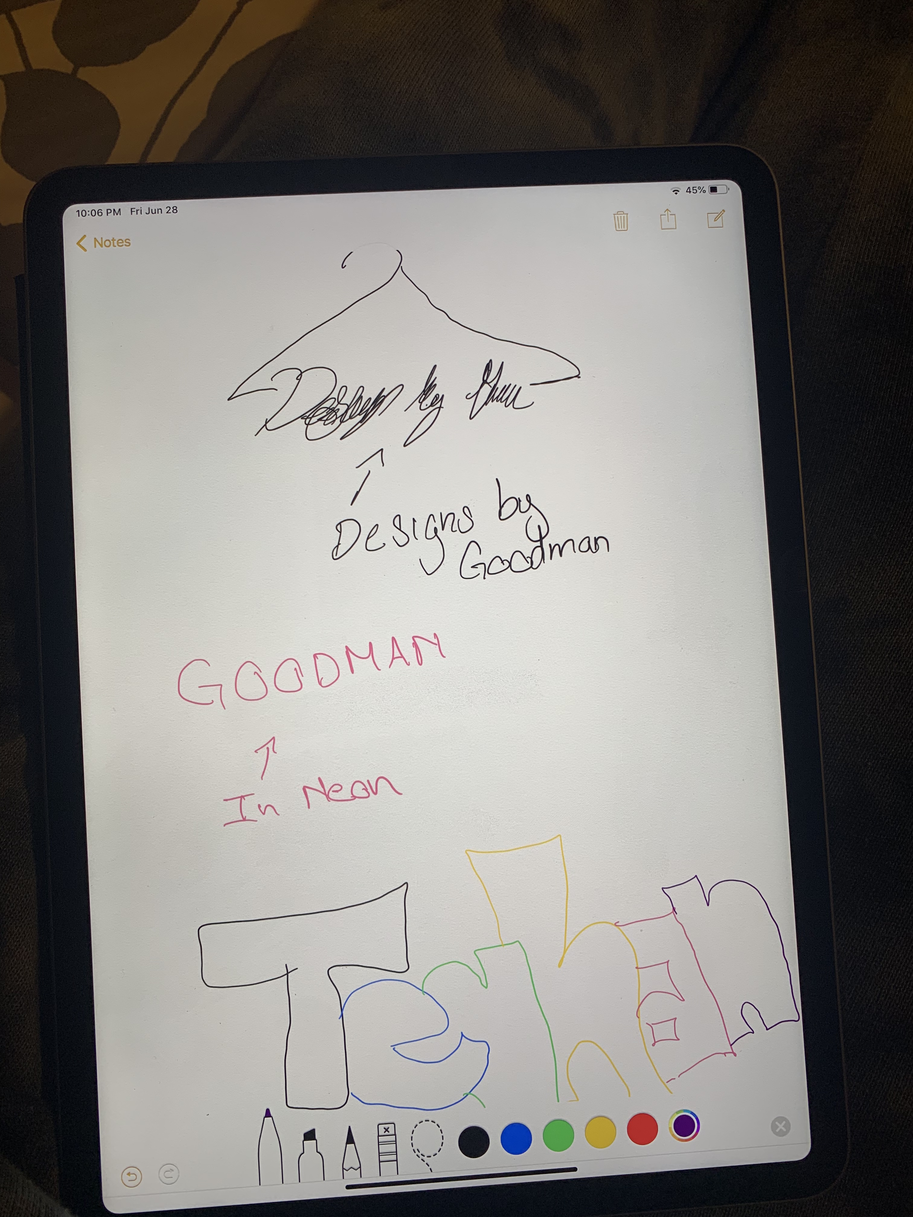
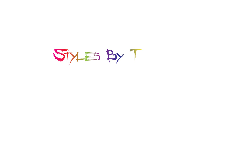
For my logo I decided to do one based on a business I have in mind for styling people for day to day wear or important events. I decided to go with just text because I knew I wanted to make it gradient or neon and I feel like adding images would make it too busy. I decided on styles by T because it was catchy and easy to remember and I feel like the best logos are just that. If I do add an image I would like to create a hanger and have it hanging off of my logo. I was thinking of using the letter y for it. I think this will create a nice balanced logo without too much going on which is what I am afraid of. I decided on gradient because it was eye catching which is what I intend to do with the people I style. I think this gradient affect shows that clearly. I also went with the text Angry Blue because it was edgy and gave it a rebellious look. I basically wanted my styling to reflect in my logo so people have a better understanding of the brand as a whole. For the process I started with typing my text and choosing the style angry blue. From there I went to object path and offset path to create the same word underneath. I edited these to -5 to make the appear on the inside. I deleted some letters and left other to create a double lettering affect. This is also how I made more slashes in certain letters. After this I went to the gradient tool and made my text a gradient but adding more colors in the scale becauseI wanted it to be colorful. It is also important to note before adding the gradient I choose no fill for the text because this creates a more clean gradient and none of the words disappear.
- Comment
- Reblog
-
Subscribe
Subscribed
Already have a WordPress.com account? Log in now.

